Beacon Artist Union
- Logo Design
- Visual Systems
- Advertising
The Beacon Artist Union (BAU) is an artist-run gallery in the Hudson Valley focused on experimentation, collaboration, and community engagement. I developed a new visual identity that reflects the gallery’s energetic and open approach to contemporary art while creating a flexible system for communicating across exhibitions, promotional materials, and the surrounding community.
Objective
BAU’s diverse programming and emphasis on creative experimentation called for an identity that could feel equally dynamic. Rather than creating a rigid system around a single visual style, my objective was to develop an identity that could adapt to different artists, exhibitions, and forms of creative expression while maintaining a recognizable connection to the gallery.
I approached the redesign as an opportunity to make BAU’s identity feel more energetic, contemporary, and accessible. The system needed to communicate the gallery’s openness to different disciplines and ideas while creating a strong enough visual presence to work across both physical and digital applications.
Approach
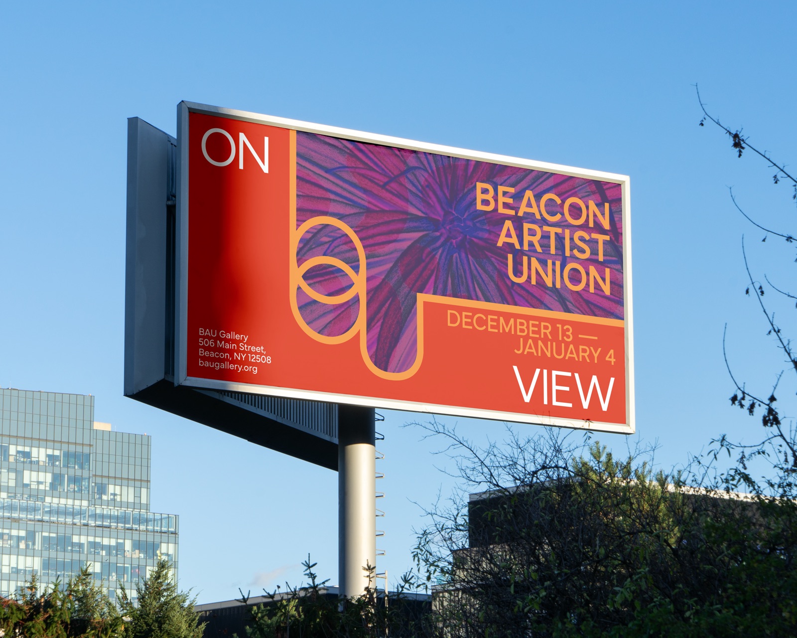
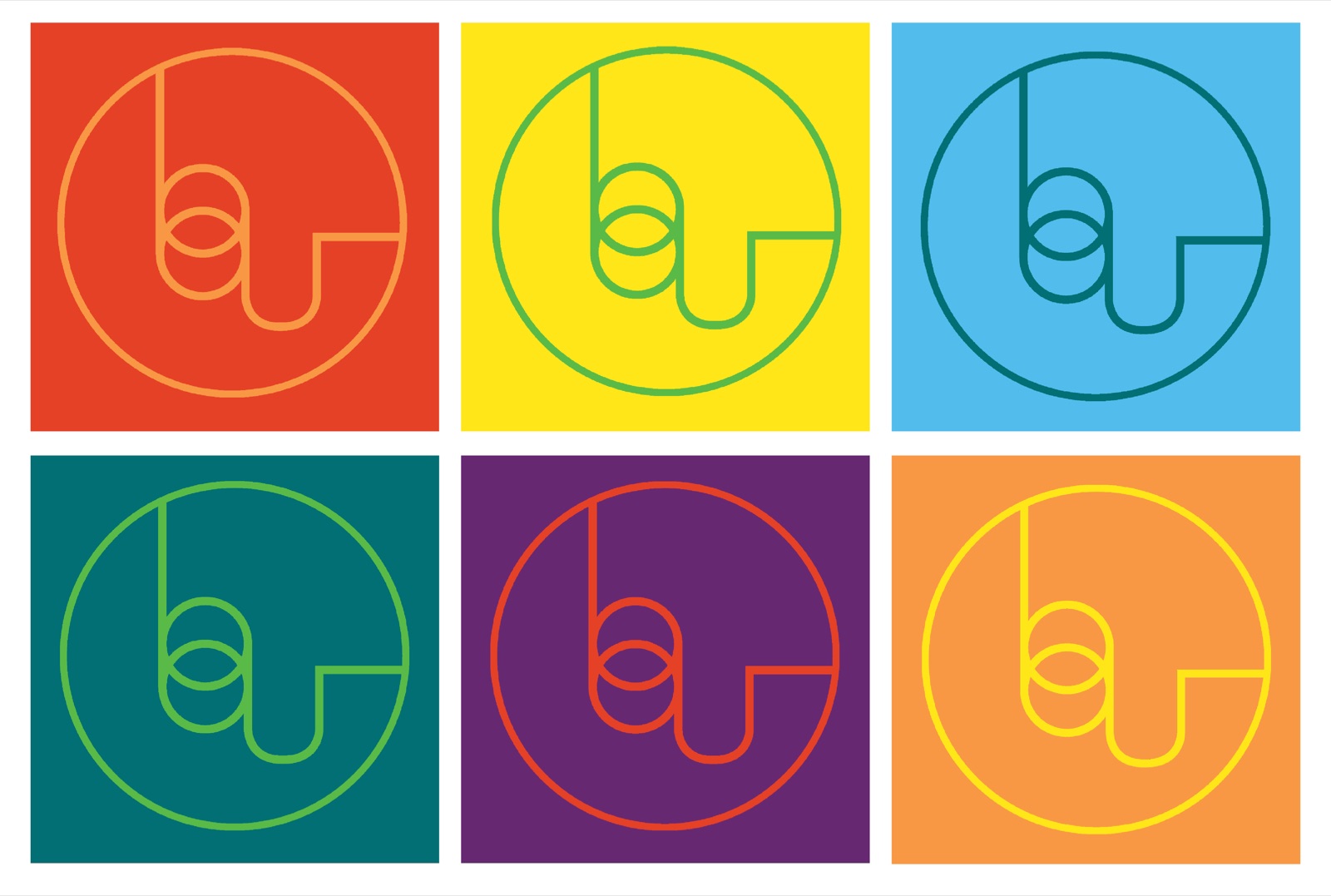
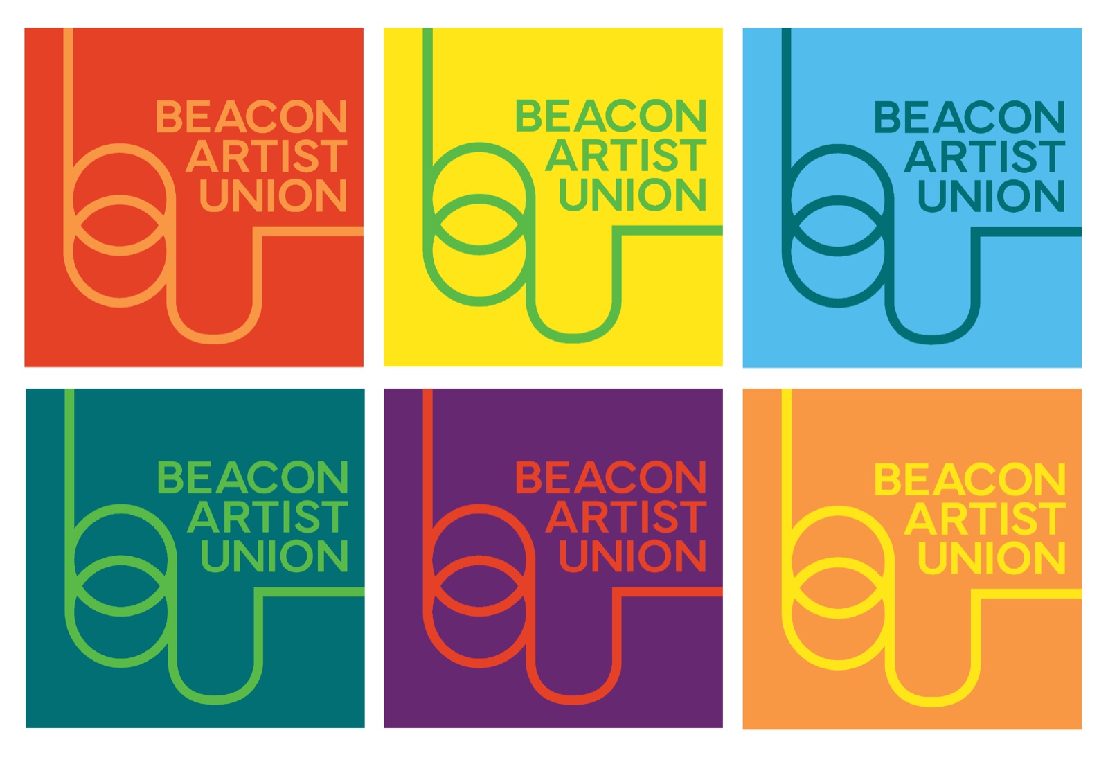
I began by simplifying the gallery’s abbreviated name into a distinctive graphic mark that could function as both a logo and a recurring visual element. From there, I developed a vibrant color palette and used shifts in scale, color, and composition to establish hierarchy and create a sense of movement across the identity.
Rather than treating the artwork as separate from the branding, I incorporated selected gallery works directly into the system through subtle color treatments and overlays. This allowed each artist's work to remain visually distinct while giving exhibitions a consistent framework, creating an identity that could evolve alongside BAU's programming.
Results
The resulting identity creates a flexible visual language that can shift between bold, energetic applications and quieter presentations of artwork. The combination of the simplified mark, color system, typographic structure, and artwork treatments gives BAU a recognizable presence without limiting the range of creative work it can represent.
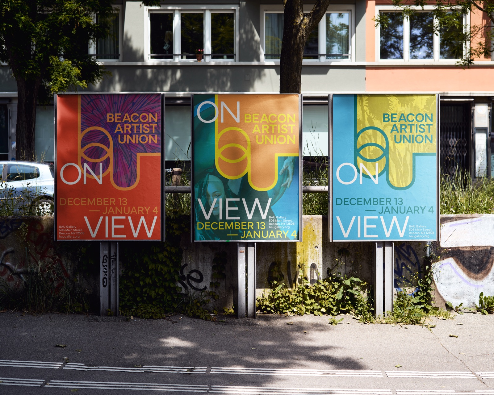
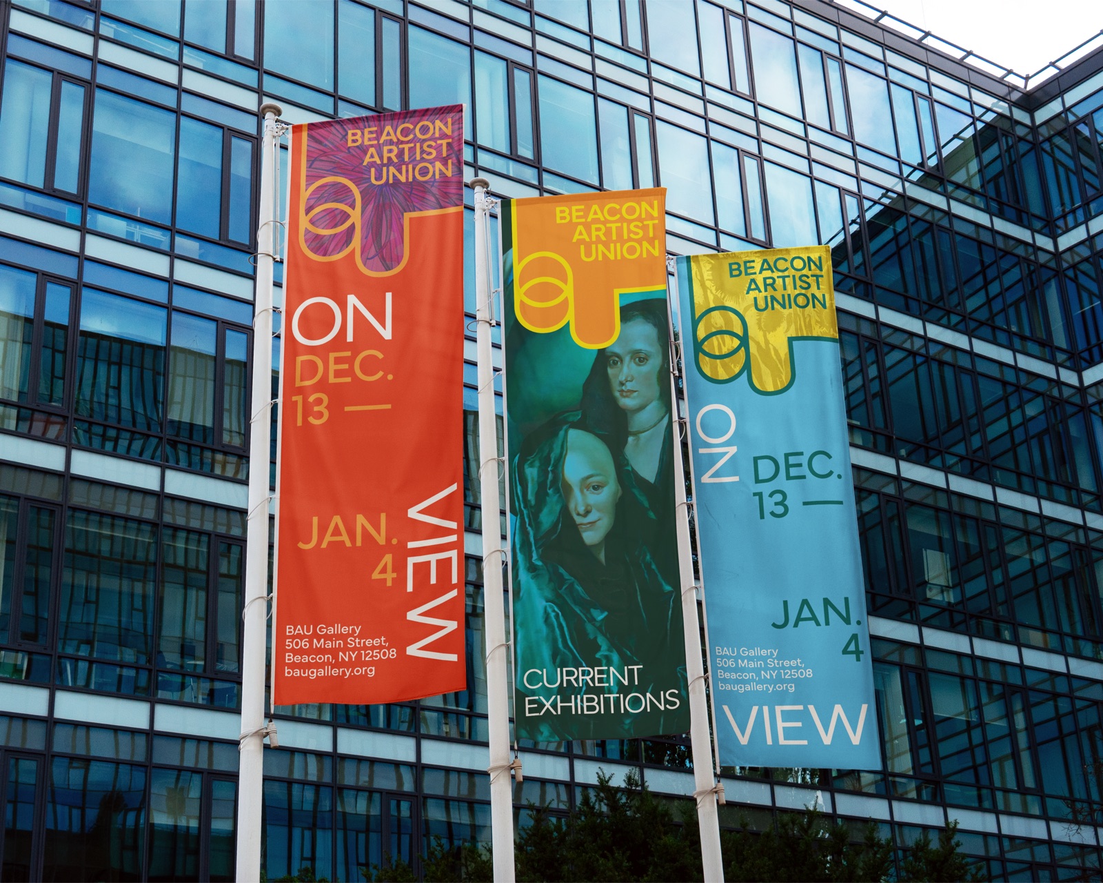
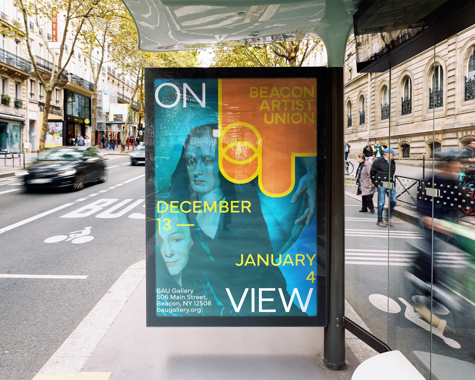
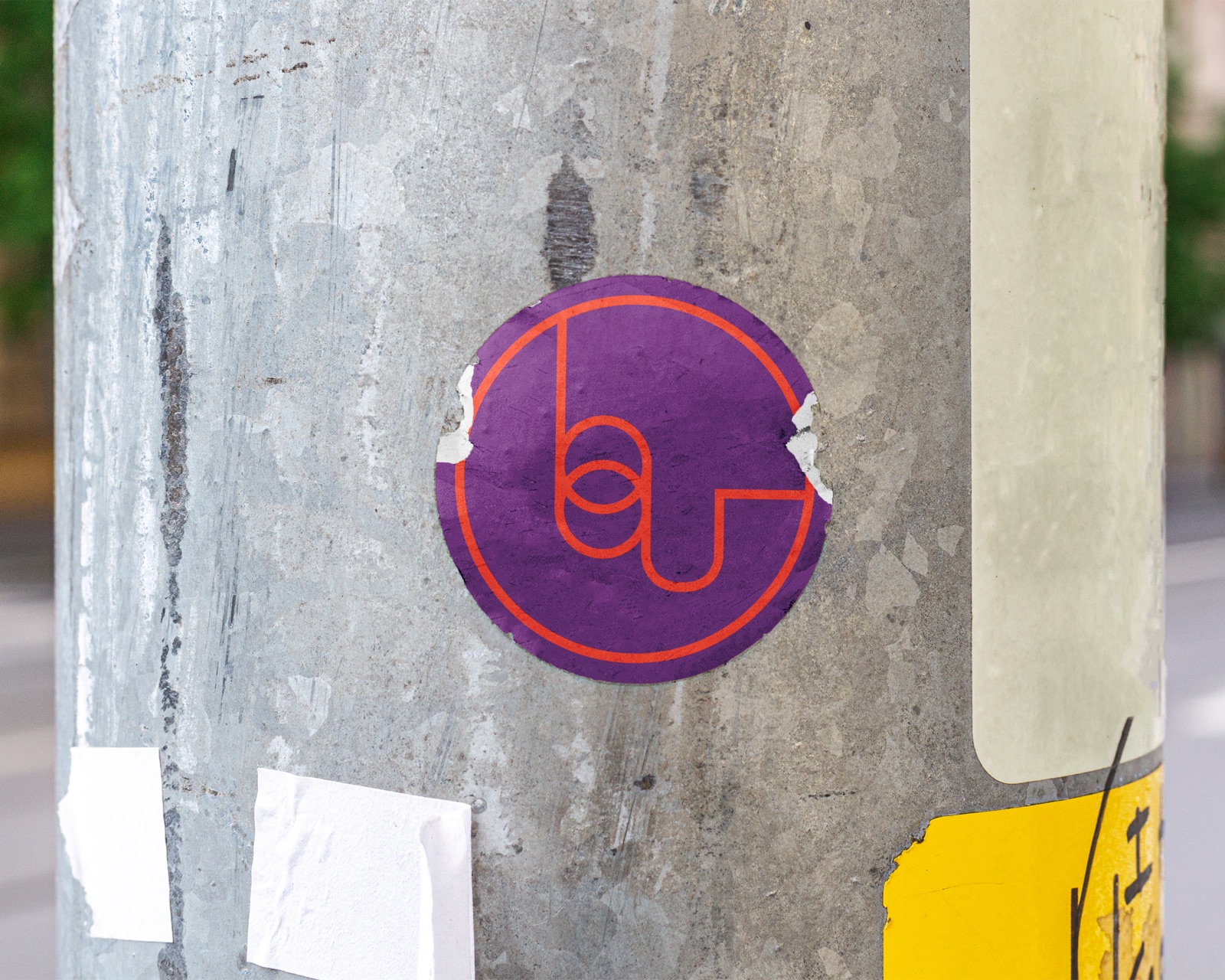
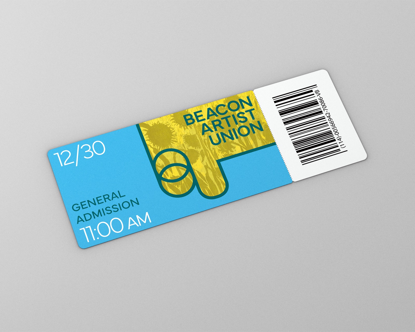
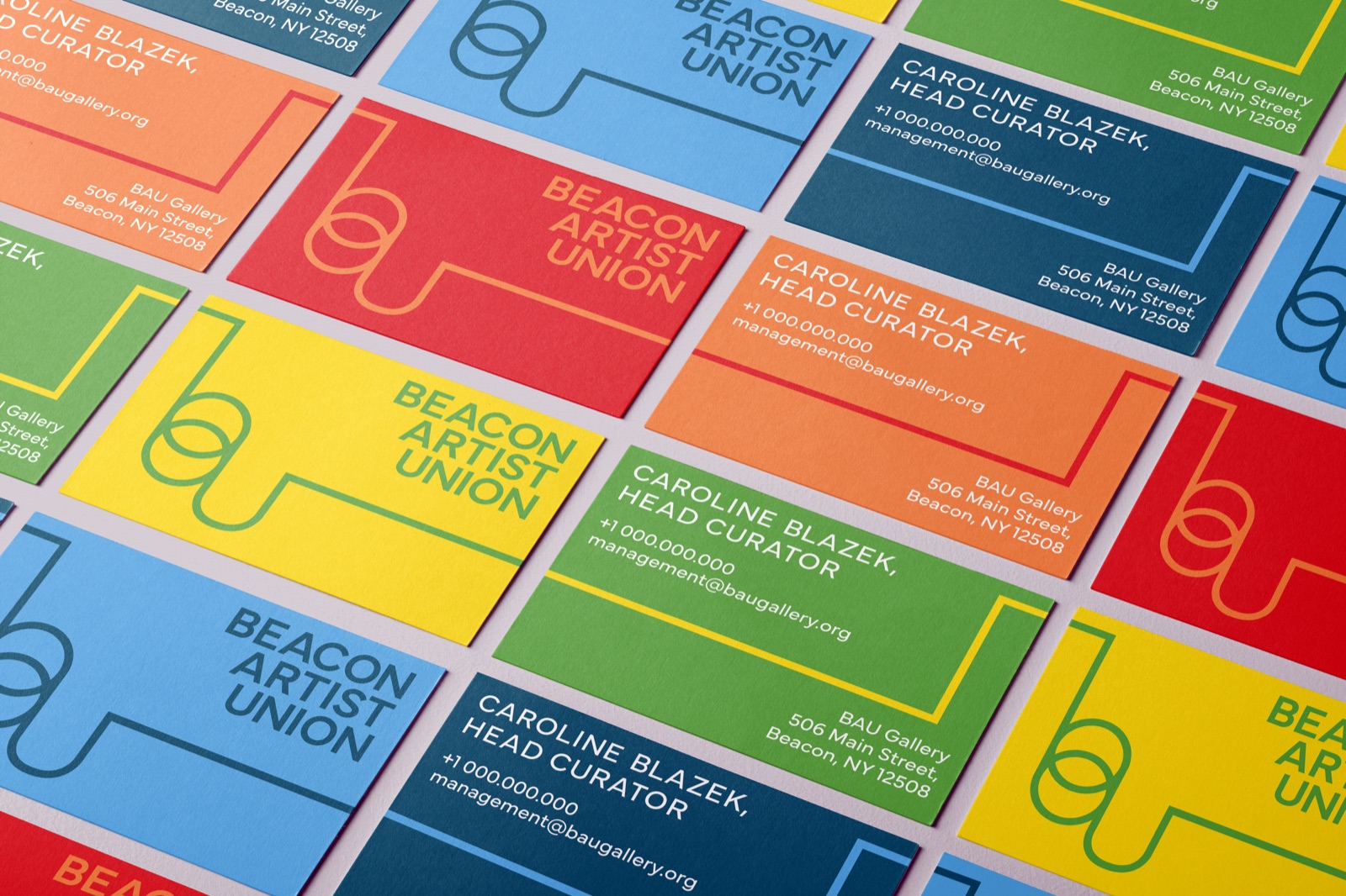
I applied the system across a range of physical and promotional formats, including posters, banners, digital advertising, tickets, stickers, and business cards. Together, these applications demonstrate how the identity can move across different scales and contexts while maintaining a cohesive relationship between the gallery, its artists, and its surrounding community.